
Gone are the days where retail shops look like they all come out from the same cookie cutter. The use of templated design schemes replicated across outlets is now replaced with a more personalised approach and spaces are responding to local contexts socially, culturally and historically.
It is inevitable that design plays a pivotal role in influencing the performance of a shop. Stores are designed for the comfort and sensorial delight of customers, and to be long-lasting. Good design engenders pleasure and comfort, meant to deliver a great experience for customers.
If you’ve been to an Aesop store recently, you’ll be seeing a vast difference in terms of its style and design approach as compared to its utilitarian design scheme in shades of copper and pink. The Australian brand is adept at conceptualising its outlets to be unique in its own cultural context — giving each store a character of its own.
Aesop has, throughout the years, built a strong dialogue with local architects and designers in conceptualising stores across the world. The brand’s approach to retail design is well informed by elements of culture and history — executed with a high level of care and respect to foster a relationship between store and customers.
In Southeast Asia alone, Aesop’s entry into Bangkok’s ongoing retail boom in 2016, saw a collab with Melbourne-based architecture practice Russel & George at Siam Paragon. It took its cue from traditional Thai buildings — stepped details, geometry, eaves and tiered structures. Gilded surfaces seen in many temples and palaces are also incorporated into the store’s display area.


That very same year, Aesop collaborated with architecture firm Snøhetta for the Singapore ION Store. The design is based on a nutmeg plantation that once occupied the site with ceiling-hung timber battens suggesting a series of tree trunks and dark sisal carpet referencing the orchard floor.
The brand’s design language continues to mature with its Kyoto outpost in Kawaramachi store that perfectly demonstrates the site-specific nature like every other store around the world. The black and white space takes inspiration from the minimalistic design of ‘Machiya’ townhouses — allowing customers to embrace local culture, architecturally.
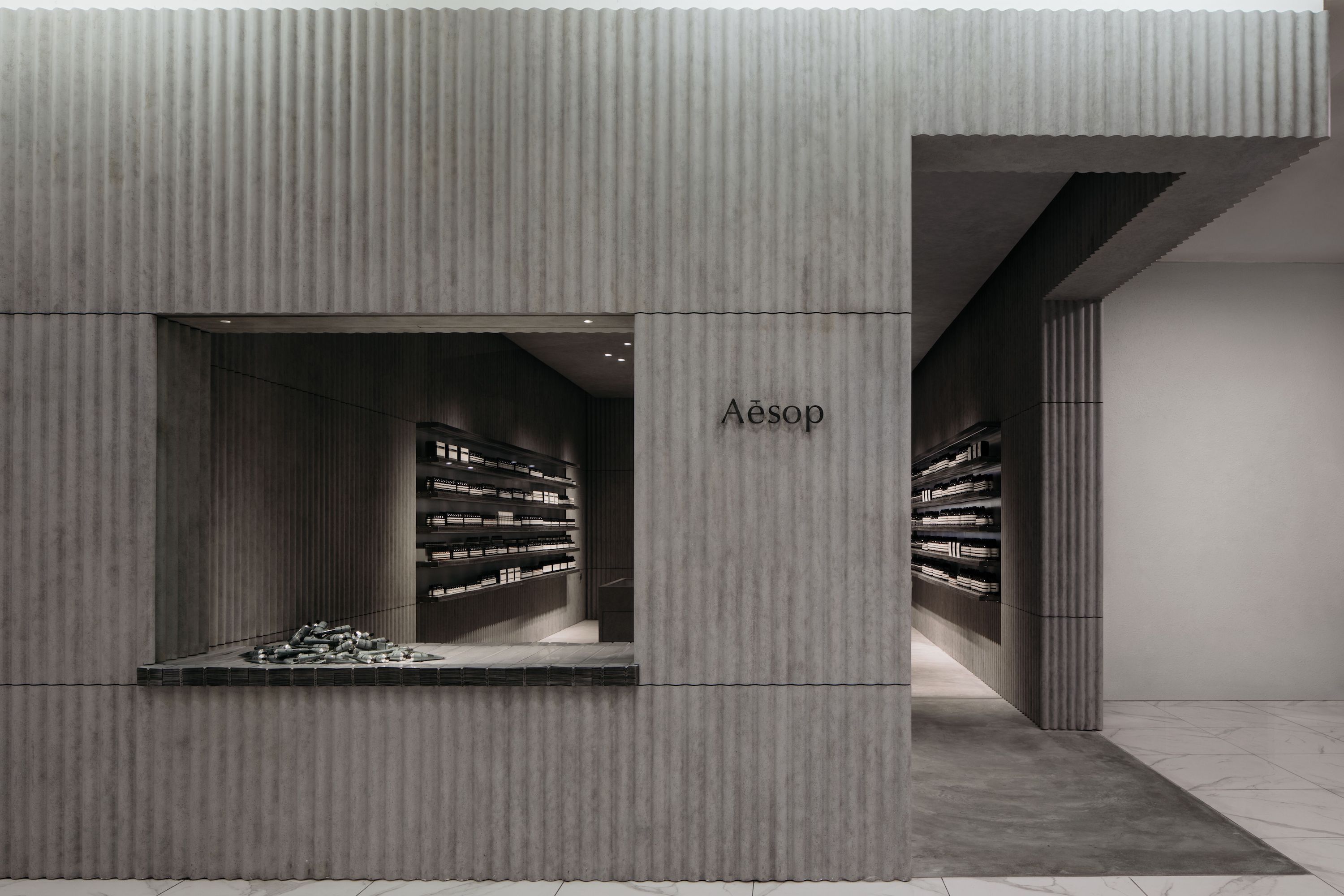
Aesop’s latest store in Malaysia is another great testament to what the brand is trying to do through its global architecture programme. The outlet, located in 1Utama, is inspired by the tin mining era in 19th century Malaya and elements like corrugated metal sheets are used to represent an important part of KL’s rich history — which in a way is educational to the younger generation as well.
Retail Architectural Manager for Aesop, Denise Neri shares the brand’s design direction as it moves into a phase where retail spaces too need to be singular.


One of my main roles is to look at new and interesting ideas in architecture across the globe and to match our architectural collaborations to the unique nature of each project. Aesop’s program covers the design of stores, counters and special projects in twenty-three countries. We also support architectural and design events, symposiums and talks in all of our regional markets.
The varied nature and cultural engagement across a wide spectrum of design and architectural projects in South East Asia attracted us to this collaboration with FARM. Like every other designer and architect we’ve worked with before, the collaboration with them has allowed an opportunity for a fresh dialogue on the value of context and place.

Kuala Lumpur has a long heritage of tin mining, so the corrugated roofing sheet was an homage to the place it has in the life and history of the region. It explores how the tin roofing can be transformed and reinterpreted without losing its essential character.
The store is built around two expressions of the corrugated tin—single sheets in vertical planes that express the corrugations as ribbed walls plus horizontal stacked layers cut cross-sectional to reveal its dense mass and edge profile.
The vertical sheets were used as formwork to cast concrete walls and imprint their ribs, so perception of the original tin is transformed by a complementary material which mirrors it.
Horizontally stacked sheets in different thicknesses form dramatic elements for shelving, display and visitor seating. Plus a basin has been set into the concrete as an indented corrugated form.

Each store is very different in concept, materiality and colour. With its use of humble industrial materials, 1Utama is probably the most differentiated from its glossy mall surroundings.
We embrace new ideas and thinking at Aesop, however the design direction for each project is always guided by its context and relevance.
Tags
Written by

Martin Teo
Editor-in-Chief
Martin has a soft spot for art and architecture, fashion and food history. When embracing his spirit-ual side, he finds himself switching between a Negroni and an Old Fashioned, especially after a long week. His day is never complete without time at the gym and three cups of coffee — flat white with oat milk, no less.